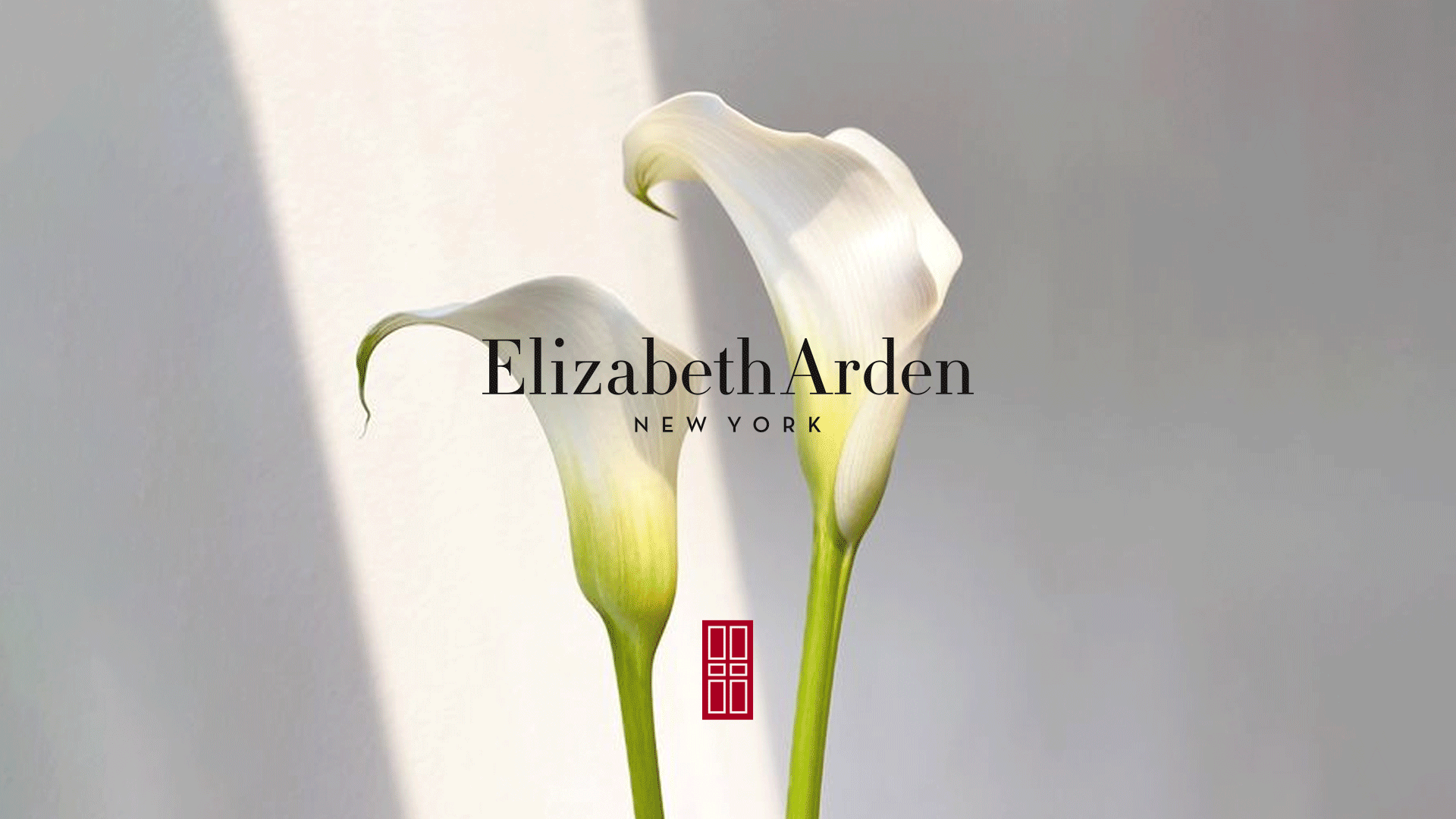
ELIZABETH ARDEN - BRAND REFRESH
Agency: M&C Saatchi TalkDesign & Art Direction: Taylar Wong, Lewis Coe
Creative: Sophie Newman & Will Cooke
Branding | Graphic Design | Art Direction
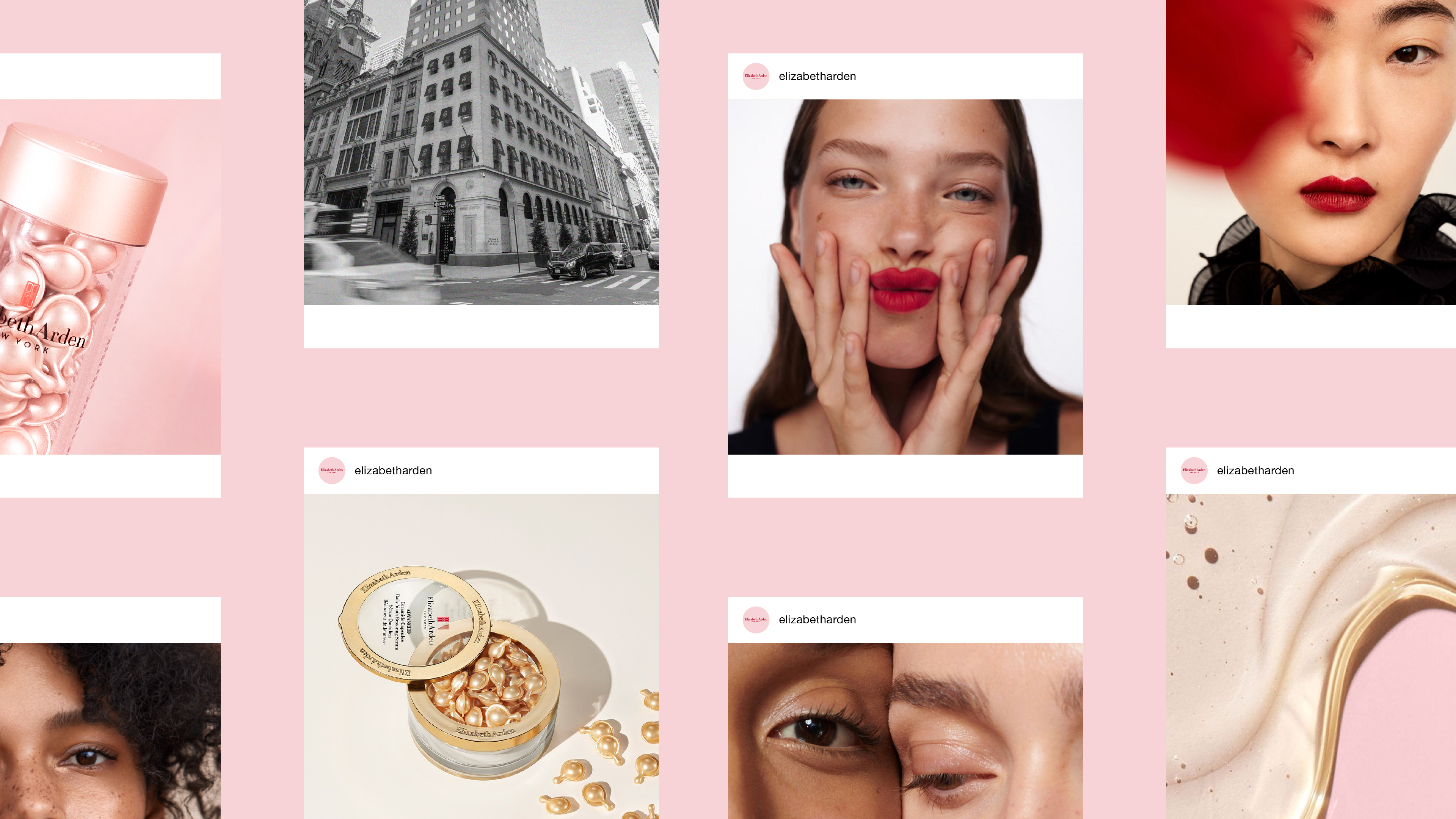
I worked alongside the team at M&CST to re-imagine the iconic, heritage Elizabeth Arden brand, to ensure their vision and ethos continued for another 100 years.
The aim of the project was to redefine the brand, updating it to ensure it felt contemporary, modern and relevant against the ever-changing skincare and beauty industry, but ensuring the core essence of the well known and loved brand remained. The aim was to attract a newer, younger customer base whilst not totally alienating the existing, older demographic that the brand was already speaking to. We faced certain challenges like having to create a brand which worked across rather varied markets across the globe, We also could not re-work any of the existing packaging, so instead had to lean into the existing designs and embrace them into our new, updated vision of the brand.
The project started with a broad audit of both internal and external competitor work to assess the already successful elements of the brand, and identify which areas needed adapting to deliver more of a cohesive brand output. This then saw the development of several potential routes, which were presented widely across the business to gain shareholder feedback, and the final vision was created.
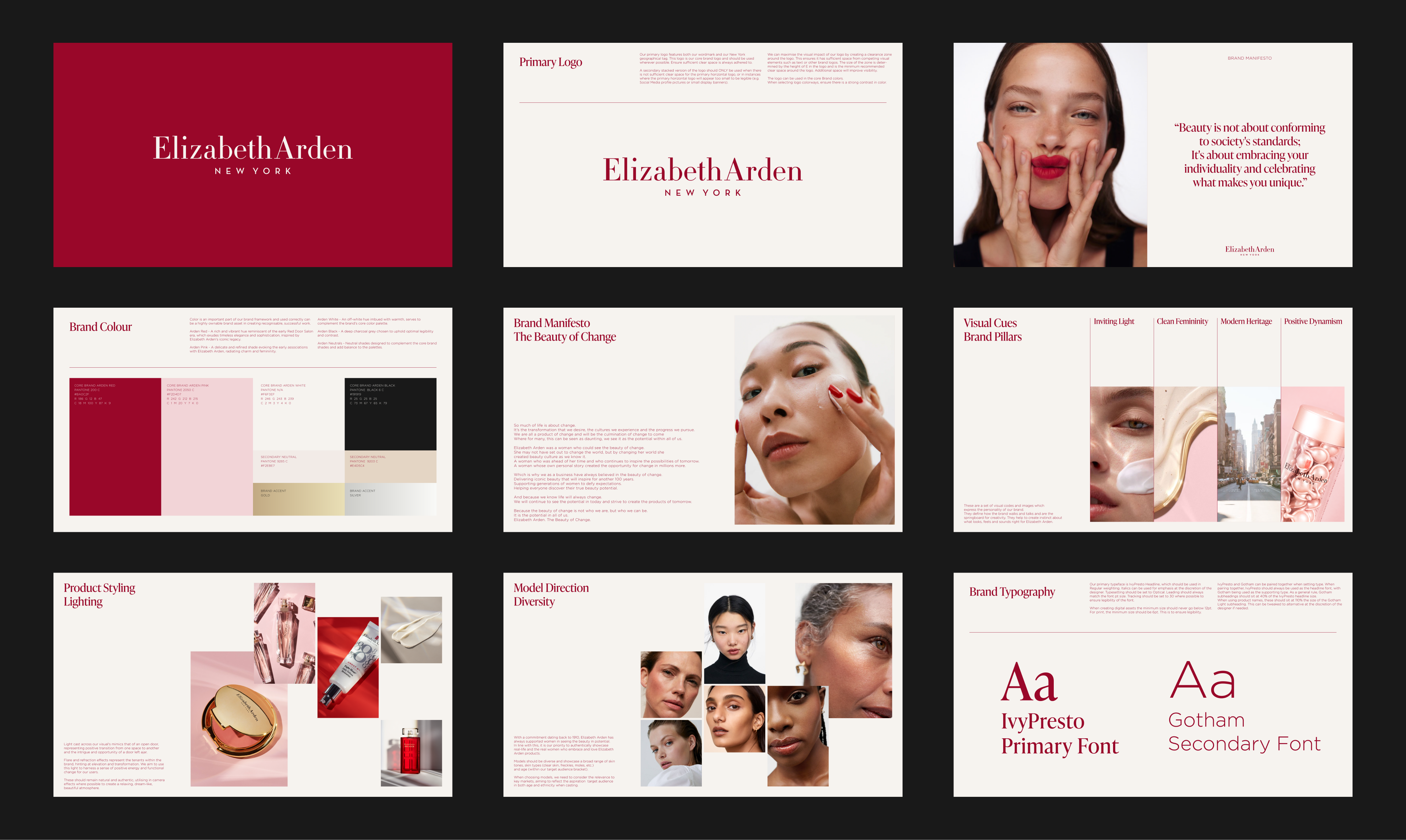
This included but was not limited to:
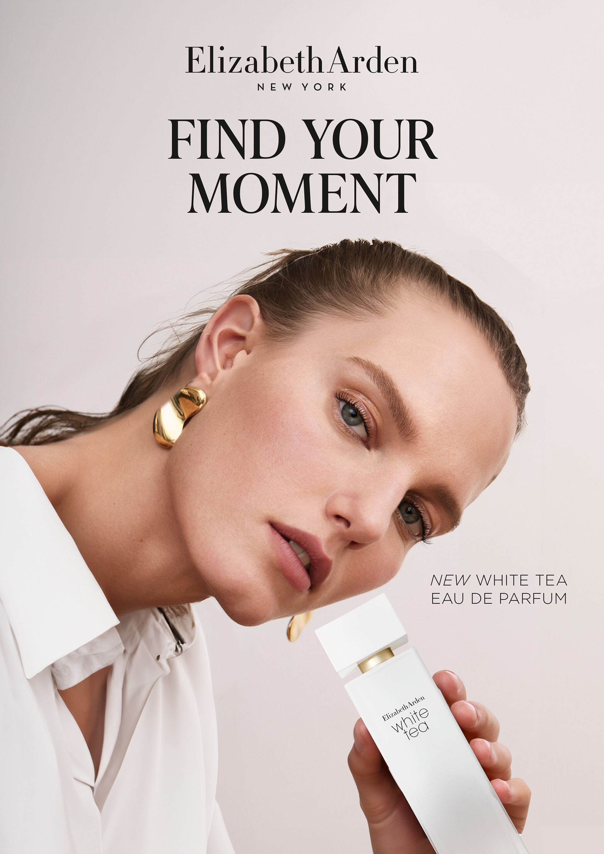
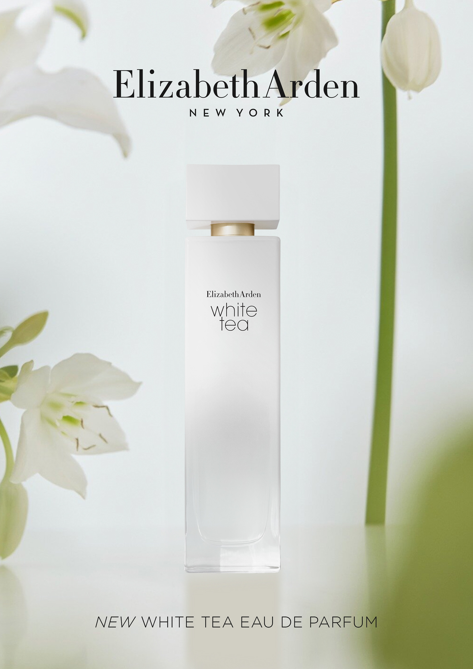
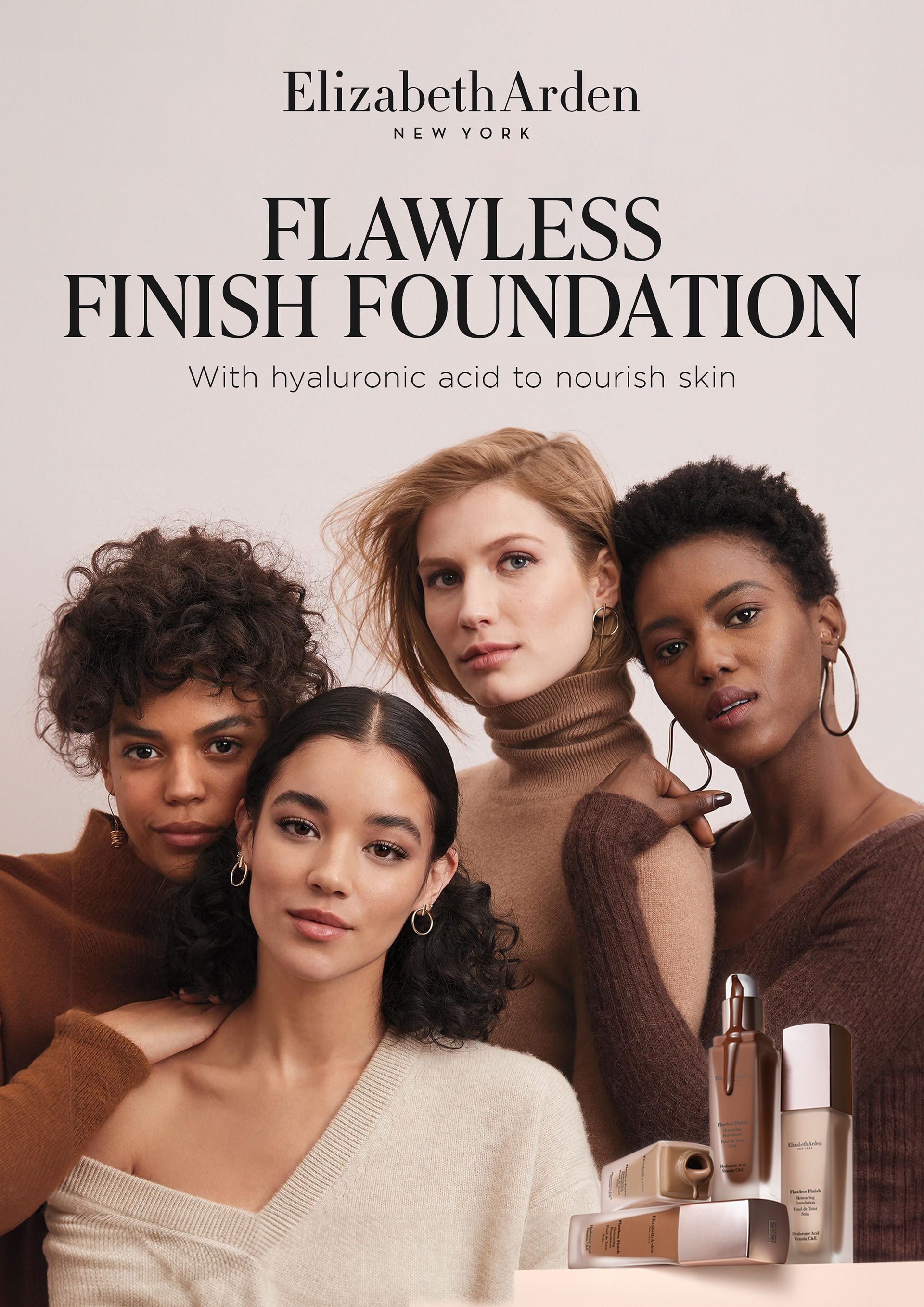
A new streamlined version of the logo (and decomissioning several other variants to ensure more cohesiveness and consistency across the brand).
A new streamlined colour palette at a masterbrand level aimed at tightening the core brand visuals, tying in more of the Arden heritage and creating a more ownable space in the market.
A pivot to a new font aimed at improving legibility in digital platforms whilst not loosing the heart and soul of the original heritage Arden font.
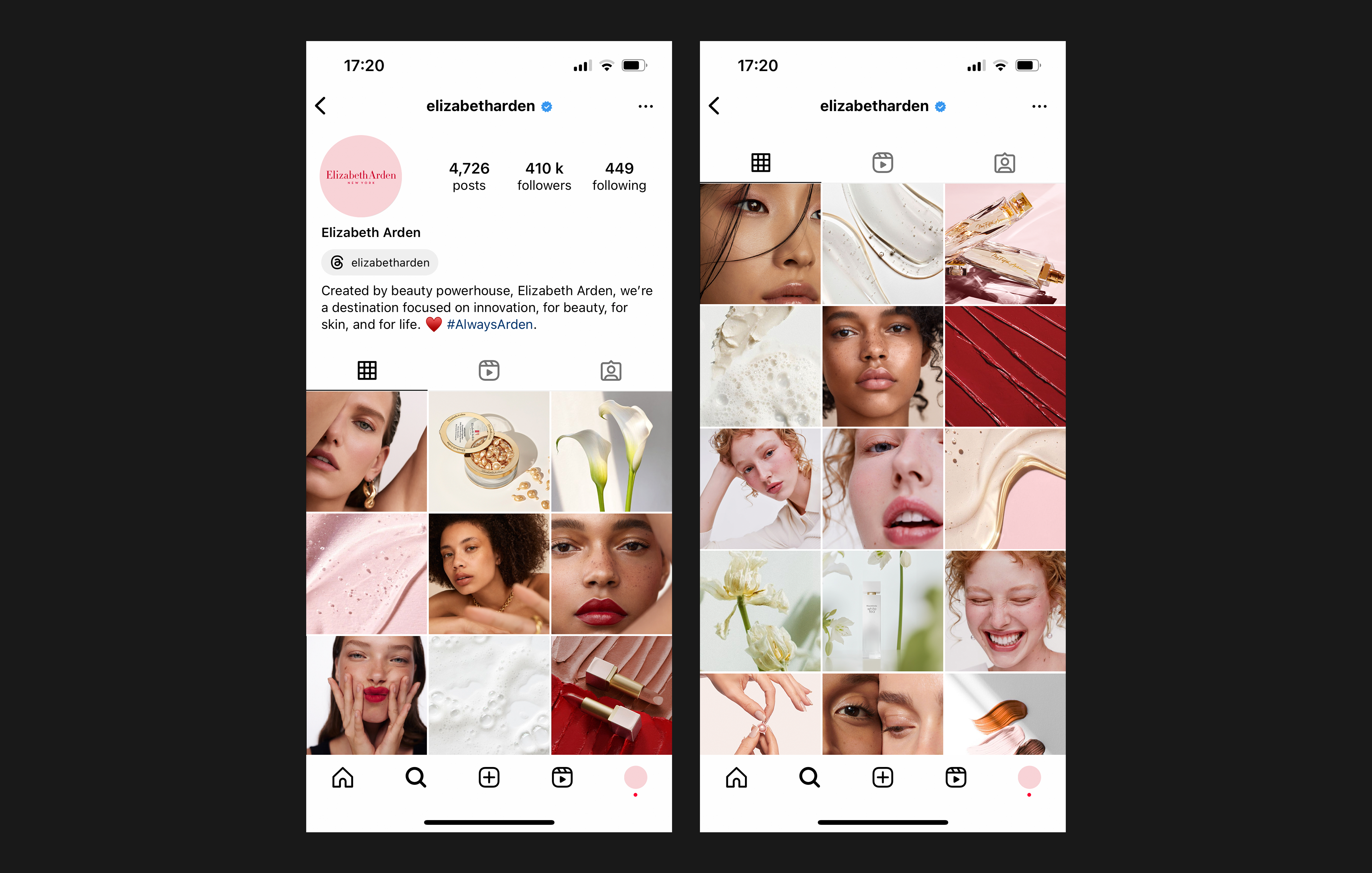
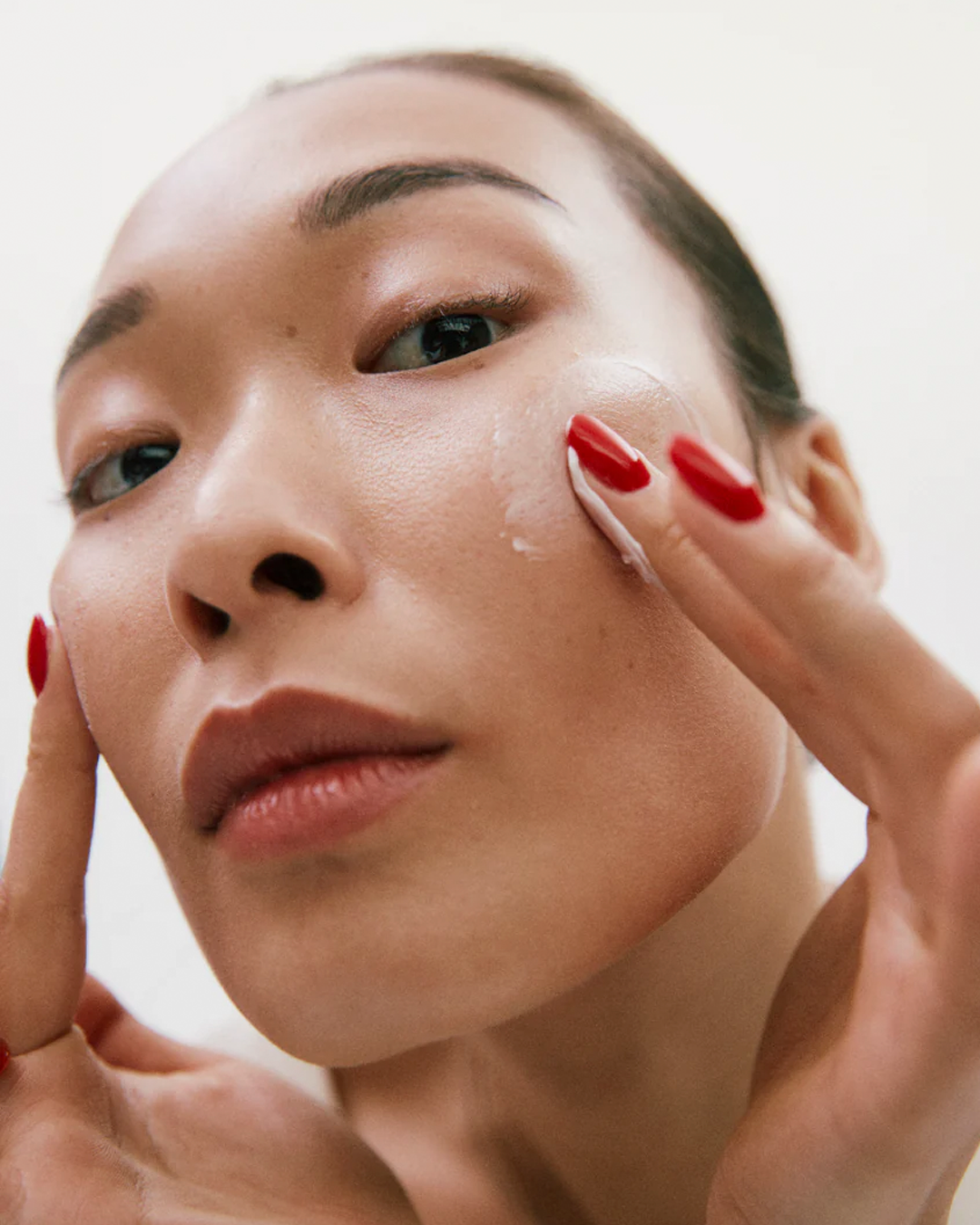
Inclusion of more model imagery across the board to reflect back consumers and be more representative of their own markets, with diversity in skin colour, skin type and age.
The introduction of more ownable art direction cues to create more cohesion across the varying markets for this tri-axis brand.
This was then rolled out across an extensive set of brand guidelines, aimed at ensuring all new brand outputs follow the new cohesive, contemporary brand vision.